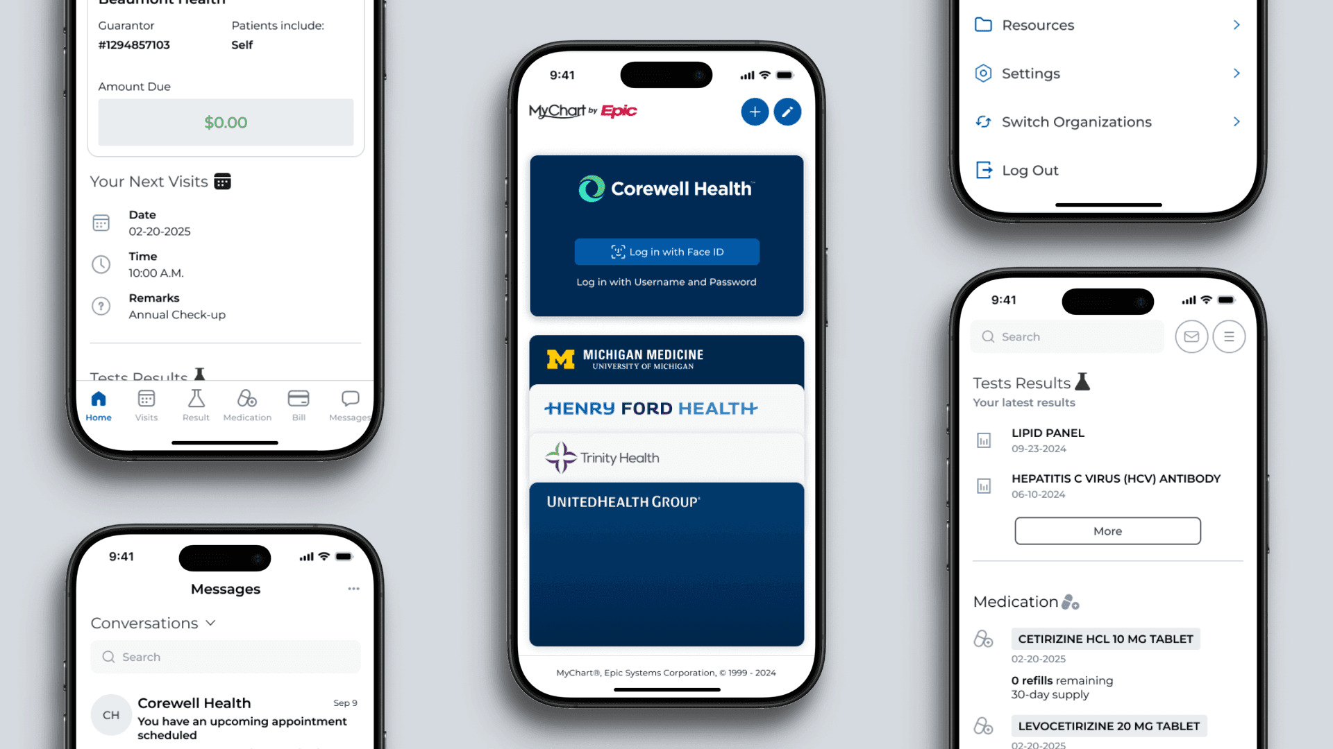
Mychart by epic
Enhancing patient experiences by fixing usability issues and reducing frustration.
CLIENT
Epic Systems Corporation
PRODUCT DESCRIPTION
MyChart is a patient portal developed by Epic Systems Corporation, a leading healthcare software company. MyChart serves over 165 million patients globally, reflecting its massive reach and adoption in the healthcare industry
MISSION
By addressing usability challenges and identifying root causes of dissatisfaction, we aim to enhance the patient experience and eliminate frustration.
PLATFORM
Mobile App
Introduction
One morning, you rushed to the hospital, completed forms, saw your doctor for 20 minutes, and had blood samples taken. By noon, everything was done. Two days later, you received your test results but felt frustrated—not because of bad news from your checkup, but due to issues with the app delivering the results. Navigating the app felt like being lost in a jungle due to its quirky interface, overwhelming menu options, and scattered button placement. Recognizing that millions of patients rely on MyChart, I saw this as an opportunity for improvement. To address these challenges, I set out to identify the root causes behind user dissatisfaction with MyChart.
Discover Stage
Collecting feedback from internet
To identify problems with MyChart, I analyzed user reviews on the Apple App Store and Google Play. These platforms provide valuable insights because customers often share honest feedback about their experiences with the app. By focusing on 1 and 2-star reviews, I uncovered recurring issues and frustrations that users were eager to voice. This method allowed me to pinpoint several common pain points and gather actionable insights for improvement.
Define Stage
"How Might We" Framework
After reviewing feedback from 1- and 2-star ratings, I identified patterns in user complaints and grouped them into distinct categories of issues. To dig deeper, I used the “How Might We” question framework to turn these challenges into opportunities for improvement. By framing constructive, open-ended questions, I aimed to uncover innovative ways to address existing problems within MyChart while maintaining a positive and solution-oriented mindset.
Below is the design process for the 'How Might We' framework
Online feedback regarding print-related issues

Ramona Schuna
" Which brings me to my next point: I cannot print any of my personal information. None of it. It’s not if I can’t print my information and keep it in my purse for first responders when they need my history, etc."

Adam Ibrahim
"I wish I could do a text search through all Dr notes. and I wish I could bulk print Dr notes instead of one at a time. "
Result in HMW
HMW
How might we make it easier for users to connect and use printer.
Online feedback regarding message system

Larry L Walker
"I have not found a good method to export information for reference, nor have I found even a “desperate” case way to print information for reference. Two other issues: 1 - Messages are not well threaded into “conversations.” Anyone can respond to a message, create a new “conversation,” and destroy the threading on previous and for future messages. 2 unable to change, assign different pharmacy to a prescription refill, or at any other time."

Sandra Ibarra
"I feel like I can’t communicate with my providers easily. Message center is confusing. And so are the notifications. Even when I check in on the app, I have to continually say I am at the appointment. It’s easier to check in in-person so I don’t get all the notifications... The app author would help patients if they would allow for deleting, or to push the notification to a folder and out of the way of more important patient information."
Result in HMW
HMW
How might we make it easier for users to get timely responses from doctors.
Online feedback regarding UI & Animation issue

Adam Ibrahim
"It’s janky. for some places the animation when you scroll down from the top is slow…I wish I could do a text search through all Dr notes."
Result in HMW
HMW
How might we enhance the user experience as seamlessly and ease the faction for users while using this app
Online feedbacks regarding Schedule and Appointment

Rob Vog
"All you should have to do is open a calendar that shows available appointments. It doesn’t do that. The filters don’t work. Basically it’s completely useless. But trying to contact your Doctor/ Nurse it is absolutely the WORST!!! I Try to avoid that at all cost. It even feels like the app is trying to avoid you talking to your doctor as well. Scheduling appointments is fine if you don’t mind waiting about 3+ months to get an appointment."

Valerie Vance
"It’s good to review up coming appointments and sometimes to schedule an appointment. "
Result in HMW
HMW
How might we help patients feel more confident and informed when scheduling an appointment with their doctors?
Key takeaways for “How Might We” Questions
Frame questions broadly enough to focus on uncovering opportunities rather than solutions.
Avoid making questions too narrow, as this can limit the exploration of potential possibilities.
Use positive language to emphasize enhancing the user experience rather than discouraging app usage.
Evaluation Stage
Impact and Effort Matrix
After the define stage, we identified several HMW (How Might We) questions. The next step is to evaluate which issues are truly worth solving. Are these problems impactful enough to address? Will users value the updates or changes? Will the solution create meaningful value in the market? This matrix serves as a reminder to stay focused on solving real problems rather than proposing solutions without purpose.
My goal is to prioritize solutions that deliver the highest impact with the least effort. By using the Impact and Effort Matrix, I can better assess and measure issues, ensuring that my efforts are directed toward meaningful and efficient solutions. This helps me make informed decisions about where to invest my time and resources for the greatest user and business benefit.
Final Result
Low Effort, High Impact
User Interface Issue
How might we enhance the user experience as seamlessly and ease the faction for users while using this app
Low Effort, High Impact
Communication, Message System Issue
How might we make it easier for users to get timely responses from doctors.
These two issues hold significant potential for creating value if resolved. They address critical user pain points and have the capacity to improve the overall experience and satisfaction.
Conclusion
The greatest challenge in this case study was identifying problems that are truly worth solving. In reality, many solutions are built without addressing actual market needs. Overcoming this challenge required active listening—turning user feedback into valuable insights instead of dismissing it as complaints. This process taught me the importance of focusing on solving problems that matter to users, ensuring every solution adds real value. Moving forward, I will focus on addressing the two key “How Might We” questions: improving the user interface for a seamless experience and enhancing the messaging system for timely responses. I plan to develop specific solutions for these challenges, starting with actionable designs and eventually progressing to high-fidelity prototypes.


